In films, Art Direction always amazes me when it works in stunning and surprising combinations. I found this web link that breaks down specific scenes from iconic and sometimes overlooked works of cinema - and then shows the color pallet that makes up the visual. In essence, it takes the creative and breaks it down into the logical choices that were made. I found it fascinating and will let some of the images speak for themselves.
The link to the full article in Digital Synopsis is also attached where it goes much more into depth about emotional responses to color, period trends separates Sci-fi from Romantic Comedies in terms of spectrum. You'll see some wild choices by Tim Burton, emotional touches by Spielberg and cerebral touches by Christopher Nolan


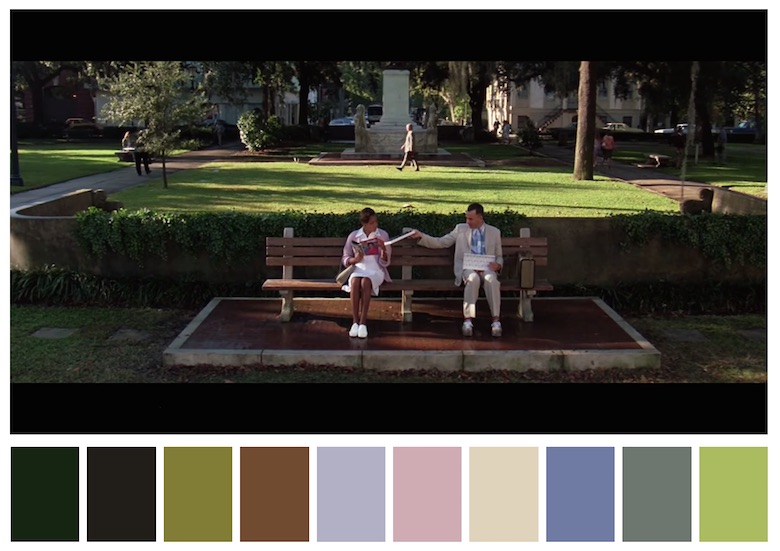
Digital Synopsis = Color Palettes
This comment has been removed by a blog administrator.
ReplyDelete